
Related Posts

Anyone buying ? Or waiting to check the bottom?
Mentor
Additional Posts in Creatives
Are there French people in the room ?
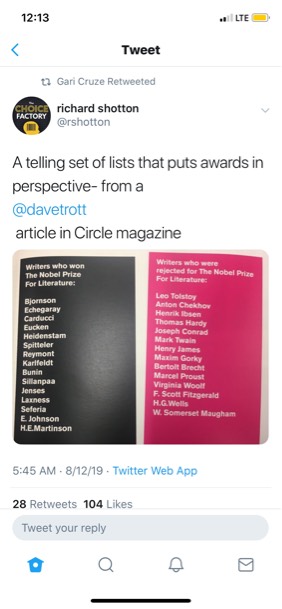
Awards in perspective
New to Fishbowl?
Download the Fishbowl app to
unlock all discussions on Fishbowl.
unlock all discussions on Fishbowl.


Hot take: I like it
Subject Expert
Definitely better visually but still an abomination of a client to work with.
Also, seeing the countless, unadulterated Kool Aid-drinking “V -team” posts on LinkedIn has been beyond painful
When I think of Verizon I think edgy and cool (I guess). “Unlimit yourself” doesn’t mean anything. The colour scheme is this yellow orange red thing that is really weak and forgettable. I’m not a designer, but red and black is really hard to get wrong. I don’t get this where this rebrand is coming from. Does Ogilvy still have this account?
They’re trying to make the V iconic like the Golden Arches. Give it enough time and it’ll happen, that’s not a biggie for me. What’s worse is the “Unlimit yourself” is just cringe to the max.
That won’t happen. It might become recognizable but not iconic.
For telecom it’s great.
It’s cute i like it. Approved!
Okay Strategist lol
what’s it look like in b/w?
McCann could never. Ogilvy for the win
Only saw the brand video that's all about "now". It's not good
Like others, when I saw it I immediately thought of Netflix, but I think it’s an improved identity from the previous Verizon logo with the checkmark. I do have an issue with overly cerebral explanations of the meaning behind an identity that sound like they were thought of after the identity was developed …
That glow is meant to symbolize “a never ending flame and energy in the truth,” says Aspiazu, which “radiates from our DNA to showcase the power inside of us.”
Come on now. How can this be taken seriously? 🙄
It’s only better now because that old checkmark-like V was so horrible. I spend years trying to balance that stupid logo in ad units.
And still, the new logo is SO much like Netflix - bizarre choice.
Yeah that original logo was a real poke in the eye. With its difficult goddamn gradient and lopsided balance. Still haunted after working with it for a couple years. I’ll take this new mark any day. Type’s tight too.
It’s just red now
In their examples the reverse has no defining features. More de-branding as a trend.
V for Viral! As in the clients are virulent.
The m in McDonald’s is French fries.
Verizon is an invisible pipe of data that wants access to everything you do and is begging for meaning…. So their v will never stand for anything. But all this looks like work other telecoms have already done, with pharma photography
Lol they are trying to be a “life brand” not even lifestyle.. just life