
Related Posts
Any thoughts on working at LinkedIn?
Pro

Additional Posts in Advertising
What y'all know about Space150?
The clients love saying “ladder up.” Hate it
What agency is doing the new Twizzler ads?
What was your most amazing day in advertising?
What’s your creative side-project?
Any fishies in new york have official snow days?
Junior Writer jobs?
New to Fishbowl?
Download the Fishbowl app to
unlock all discussions on Fishbowl.
unlock all discussions on Fishbowl.


I like the concept. Copy feels off brand.
Rising Star
That campaign is better. A LOT better.
Looks like student work to me.
So, it Looks likea student did it?
Sorry.
A pun or simple wordplay is not a real concept.
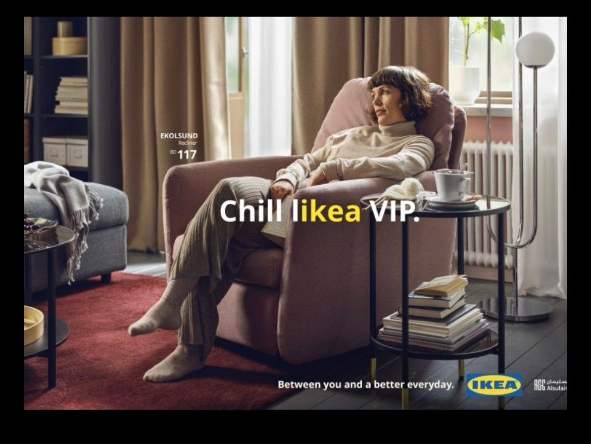
There is no emotion in a pun. A pun doesn’t persuade. A pun doesn’t hit you in the gut. A pun doesn’t make you think, “Wow, I never thought about it that way before, but that’s so true.” If the pun’s only function was branding Ikea, that would have been passable, yet there’s no Ikea-ness to the pun. It falls flat. Why should I care about Ikea in this ad?
This is why I don’t think it’s good.
And the “Between you and a better everyday” tagline somehow made it worse. That’s one of the most generic taglines I’ve ever seen for any brand. It’s horrible. Their “Unböring” work was a million times better.
Pro
Right. We can blame copy all day long but if the brief is “make something!” then you get… something.
But that's not how ikea is pronounced
Seems like everyone gets it
Sad state of the biz if this is what’s getting love.
Think of these legendary campaigns that play off the brand name itself. The brand’s voice comes through loud and clear:
“Absolut[e] ______” for Absolut
“Schweppervescence” for Schwepp’s
Now look back at the Ikea campaign and notice the quality drop:
“Float likea butterfly” — Ikea
“Study likea boss” — Ikea
“Sleep likea baby” — Ikea
There’s no Swedishness, no affordability, no quirkiness, no nod to minimalist interior design — there’s no branded Ikea-ness at all in those Ikea headlines. No voice. The headlines basically say “Here’s a duvet cover sold by Ikea (?!), here’s a desk sold by Ikea, here’s a bed sold by Ikea.” It looks like a graphic designer created this headline-based campaign.
Right, and they speak to quality and comfort which Ikea is… not exactly known for.
Even if you’re into the idea that adding an L to Ikea makes it Like A (which, for the record, I think nauseatingly stupid) this would be an infinitely smarter campaign if they leaned into what makes Ikea Ikea, which is it looks the same as expensive furniture but costs ten times less.
This would have been a way better campaign if they but their chair next to a similar chair that costs $5000 and said “The Havberg. Just likea Eames.”
On a scale of one to five meatballs, I give it one meatball.
I find it incredibly forced, personally. Combining ‘like a’ into one made-up word just doesn’t work. It’s like it almost worked and then instead of moving on they tried to cheat the English language.
On top of that, finding words within sentences and highlighting them isn’t that interesting or new anyway.
And I cbf even getting started on the line ‘Chill like a VIP’ or the Art Direction.
Actually really bothers me when I see this getting kudos. (Yes, I need to get out more.)
Clever
Lifestyle pic with a heavily branded line. Soulless clutter.
It’s confusing. Also tripped up on “everyday” as one word which is normally an adjective but I think they are intending it as a noun? And also agree with someone else who said that this person doesn’t not look like she’s chilling like a VIP.
You do this and still feeling the need for the logo and a line in bottom right means it has failed.
Failed?
Mid
I like it, and I wish I did it. Getting anything done these days is hard. Sometimes, we don't need to reinvent the wheel; these ads meet their purpose.
Are VIPs famous for chilling?
“V.I.P. Chillin’” by Chucky V
https://open.spotify.com/track/5czV1xo41LYW2kSeRZ5tmW
“V.I.P. Chillin’” by Swizz Beats and Dr Dre
https://genius.com/Swizz-beatz-vip-chillin-lyrics
“I'mma motherf*ckin alcoholic/Guzzle it to the last drop, I need all of it/You thinkin' I'mma call it quits? Sh*t I'mma baller, b*tch”
Certainly makes me think of affordable Scandinavian furniture!
It’s not nearly as clever as they think it is.
I like it
Not sure about the art direction 🥱
Good idea but a space between “like” and “a” would make it more clever and more on-brand. Feels likea client insisted on that detail so people would “definitely get it”. You only need the colorways. Using both is a hat on a hat.
You’re entitled that that opinion. Explain why.
And also. The model doesn't even look like a "VIP." She looks kinda depressed.