
Related Posts

Bowl Leader
I need 11 likes.
Hello fishes
I want refferal in atos.
Please DM me
Additional Posts in Creatives
Community Builder
Community Builder
What’s DDB like these days?
New to Fishbowl?
Download the Fishbowl app to
unlock all discussions on Fishbowl.
unlock all discussions on Fishbowl.


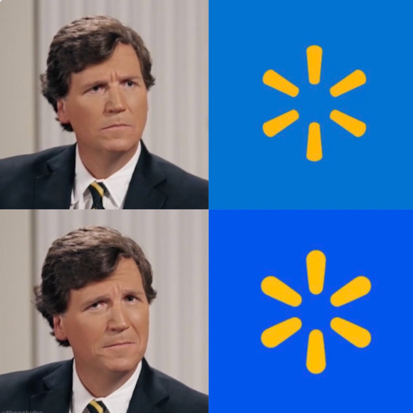
Not gonna lie, I like the new blue better. The entire internet is mad about this rebrand but I think this is a classic example of humans hating change. I particularly don't understand the rage because there isn't much of a change. :D
It’s a refresh, not a rebrand. It did what it needed to do effectively.
My guess is either an agency was hired to do this or an in-house team did this. I promise no designer was paid an ungodly amount of money to do this lol. It was likely just their normal pay. Plus, haven’t we all been on projects that go through rounds and rounds of approvals and all the cool stuff gets nixed until what’s left is so anti-climatic you want to cry? It’s also likely this was meant to be a super slight update and the internet is running wild with “THIS is their re-brand??”. Folks need to chill haha.
I'm the guy in the meme.
This is why no one is taking our profession seriously
The "new" wordmark is the real evolution.
Away from light, "facebook" or "amazon"-ey look and back to the chunkier, stronger presence of the WALMART past. I always thought the "walmart" was a big overcorrection, they're right to adjust.
New logo looks better too.
Inside sources have told me that when they presented it in an internal virtual meeting to their staff, laughing emojis filled the screen.