
I'm excited to share the launch of my new portfolio site, chrisjpopp.com, showcasing over 25 years of UX, UI, and product design leadership across fintech, SaaS, health tech, and regulated industries.
Related Posts
Community Builder
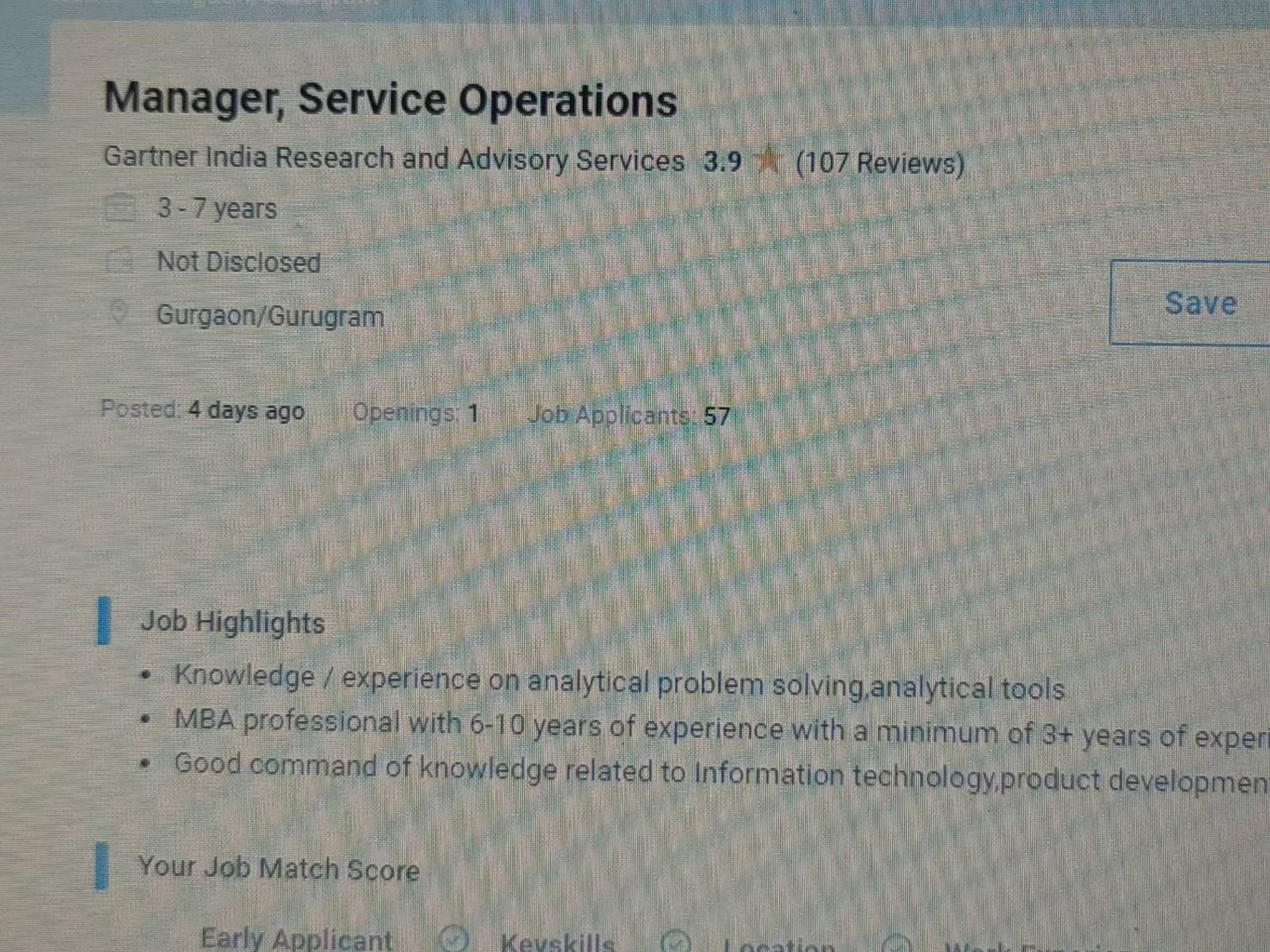
Can anyone please please refer me Gartner


Pro
Additional Posts in Designers
Coach
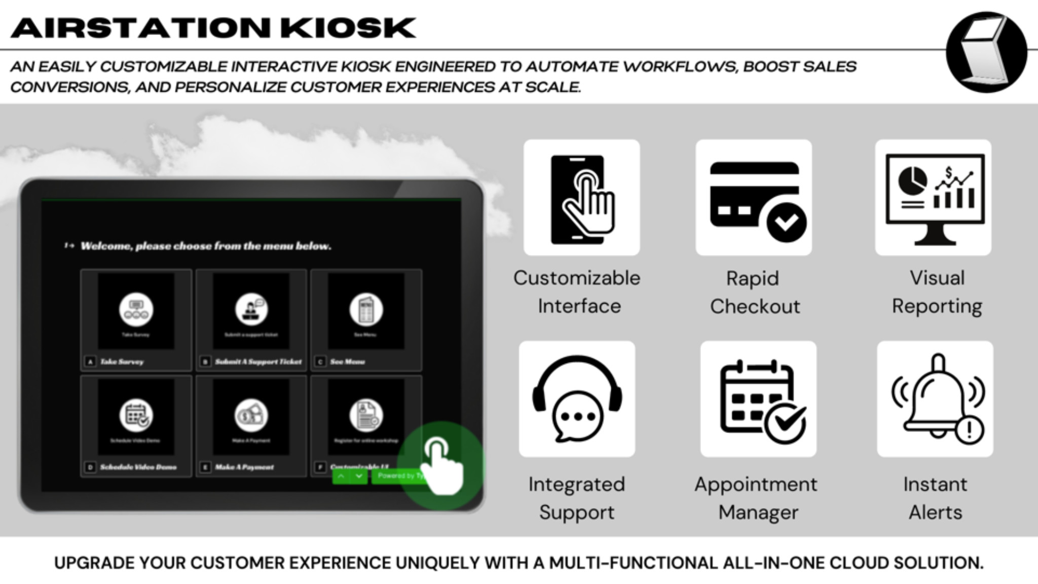
Hey Bowlers, I launched an interactive kiosk leveraging Typeform to automate onboarding and personalize customer experiences at scale.
Key features
- Rapid Checkout
- CRM Synchronization
- Integrated Slack Support
- Data Manager
Open to pessimists and optimists alike to give honest feedback on what you think about the product. In search of teaming up with a designer (with pay) if you have useful insights or better story telling abilities. (See link below)
Please and thank you.
https://www.canva.com/design/DAErzR4fnbU/94_1cMfCiV9zU_pHWhZG8w/view?website#2:take-action-now-and-receive-a-50-discount-offer-expires-10-17-21
Coach
New to Fishbowl?
Download the Fishbowl app to
unlock all discussions on Fishbowl.
unlock all discussions on Fishbowl.


Hey Chris, your website has a good foundation. You sound experienced, tell your story well, and have a good selection of work (hopefully recent) to present.
On the other hand, I think your visual presentation is lacking. While I did enjoy you using Gen AI to embed yourself into classic stock photos we’ve all used at some point, it wasn’t enough to distract me from how your site looks and feels overall.
I’d recommend you giving your site a proper click through on both mobile and web, there are a lot of links that are broken, and interactions that lead nowhere (ex. your design work page doesn’t lead to the work you’re showing on your work or case studies, and the two projects open a lightbox with a guy in sunglasses)
Your visual approach looks outdated, which is a little concerning as you’re also presenting yourself as someone who can lead the build and scale of design systems. I understand that you might be more of a lead/design manager vs. an individual contributor, so I’d recommend using a minimalist template on a site builder instead of trying to build the site yourself so that you can focus on telling your story instead of trying to worry about visual details.
Gradients have made a return in recent years, but as background visuals, not in containers or text.
Once again, your story is great and I have no notes on the way you present yourself through text, but it’s difficult to sit and read what you’ve written because the overall visual direction of your site needs more polish.
I don’t mean to sound harsh, and I hope all my comments come as constructive and not destructive. I’d love to see the update if you do make some of these changes.
Hi Design director, could you pls go through my portfolio ayodelerachael.com when you have a moment? I’d love to hear your thoughts and know what I could work on to make it better.
I have suggested to others that they REALLY take the hiring manager seriously as a user of their portfolio site. Talk to some hiring mgrs you know. Create a persona. Write up some tasks. Do some usability tests. I generally check portfolio sites AFTER a resume has passed my first filter. I am generally looking for very specific things. I want to see how interacting with users affected designs. I want to be able to see at a glance with tags or something why I might want to ready a case study. What business impact came out? What skills are demonstrated? Etc. Just imagine you have 15 seconds to convince me I want to spent 5 minutes.