

Related Posts


Bowl Leader
I'm here for the pants party.

How to be an exceptional buddy to my intern?


Rising Star


How is John St these days for accounts?
Additional Posts in Portfolio Review
Bowl Leader
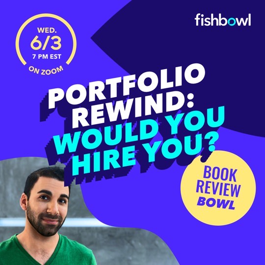
Hey, Fishies! We’re launching our first Interview/Q+A series "Portfolio Rewind: Would You Hire You?"
Like a portfolio review in reverse, creative leaders will share work they created when they first started out and critique it as if were a book that had just landed in their inbox. Then, tell us if they’d hire their younger selves knowing, and expecting, what they do now.
Drop in for get the chance to ask questions, and get your book reviewed by our guest. Hope you can make it!
zoom.us/j/92635977143
Bowl Leader
Can you put spec work in your book?


New to Fishbowl?
Download the Fishbowl app to
unlock all discussions on Fishbowl.
unlock all discussions on Fishbowl.


Bowl Leader
I think it’s clear you have talent. You should probably be able to find a job or an internship. But, it might not be at the place of your dreams just yet. A lot of your concepts are just short of landing, or lack a bigger, unique conceptual thought.
MASTERLOCK
The tagline is really interesting and unique. “Boring at its best” is really hardworking and is a clever way to address product’s selling point. The art direction makes sense, too. Where I think it loses some of its luster is the headlines. You were going for boring. But, somehow they felt overwritten. It felt like you were leaning on your affinity for poetry. So, it landed in neither place. In my opinion, when I think of boring, I think of extremely elementary writing. Simple sentences “Bob likes cats.” To me, if you could nail one simple headline that’s proves how well the lock protects, it would make the execution stronger.
CHAMPION
It feels like another iteration of things I’ve seen before. Levi’s. American Eagle. They’ve all done some version of this. The tagline is nice. The headlines are fine. But, overall, it’s lacking a concept. Also, not sure how the record player fits into everything else. If you decide to keep it in your book, I’d move it down in the order.
MARSHMALLOW FLUFF
Liked the lines. See where you’re going. But, the tagline doesn’t quite payoff the thought. You’re equating the fluff to clouds, right? Feels like it needs more specificity. Like, “Tastes like it’s from above.” (Better than this. But hopefully you get my drift. lol)
Also, the stunt feels first thought and done before. You have a nice thought for a campaign. Lean into that more. Most of your headlines talk about heaven. So, for example, how can you recreate heaven in unique places with marshmallow fluff? Or, how can you recreate the feeling of marshmallow fluff? Or, how can you get people to try marshmallow fluff in spaces that give off the feeling of heaven? If you come up with a killer activation that might even become the core of your campaign with the other 360 thinking surrounding it.
Generally speaking, if you’re going to have an activation in your book, you want it to be fresh and something that will make people go, “Huh, that’s clever.” or “I never would’ve thought of that.” Try to avoid throwing them in to round out the campaign. It brings some of your more solid thinking down.
NEW YORK PUBLIC LIBRARY
It feels like two different campaigns. You have the thought around the collection of books and a POV there. Then, you are looking as the library as a travel guide, which seems like a different thought.
I think this happened because you’re looking at “Making the public library truly public” as an idea versus a creative approach. A lens which you look at the work through. It’s the “how” you bring the idea to life.
So what an idea would become is, “Turn the books at the New York Public library into a travel guide by making the public library truly public.”
That said, I’d either lose the containers placed in different places or reframe them to fit the travel guide idea. For example, you could turn them into tourist information kiosks. If you keep them, I’d place them near the end. So that it feels like an addition to the idea. Versus the idea itself.
Also, the page where you say all the books that are included in it feels a little confusing. Felt like a second set of print ads that didn’t really tell me anything about the campaign. So, either complete the thought and turn them into ads. Or, see if there’s a way to incorporate that information into the comp. For example, it could be on a pull up banner next to it. Or, maybe listed on the side of the container.
How does the Learned Lion fit into your travel guide story?
TELESCOPE
This felt fine. But, it felt like something was missing until I got to the end image of the calendar. Then, it clicked. What I was struggling with was that your examples are things you wouldn’t be able to actually see with a telescope or things that happened in the past. What could be cool is to highlight those once-in-a-lifetime space moments that are better viewed with telescope. An asteroid show that happens every 135 years. A view of a planet that can only be seen at a certain time with the naked eye.
I’m making these things up, obviously. lol But, the point is that by focusing on real history that you can actually see with a telescope that people shouldn’t miss gives it a FOMO factor and makes it feel more aspirational.
DATING APP HAIKUS
These were really fun! I audibly chuckled at a couple. Nice work!
I know this is a lot of thoughts. But, I really do think you have talent. Like, I said, you’ll be fine with what you have. It just may not be the tier of place you’re looking for. If you want to aim high, consider taking another stab at the work. But, either way, you’ll be fine. Good luck!
Looking on a desktop, not mobile. It feels to me like you’ve over simplified. It works in some areas but not all.
On mobile, copywriter doesn’t show up. That is a must.
Play what? Need more context.
Meet me*
Email and phone link isn’t clickable.
Add that and some social icons for insta, linkedIn, etc. at the top.
Can’t view resume without being forced to download it.
I appreciate the time you took to take a look and the feedback you gave! Better to have tictac feedback then hear the work isnt working!
Hey posting here, in itself, is brave so it tells me you’re ok with reframing criticism as an opportunity for improvement, iterating, reworking.....egoicide. That’s an awesome quality in a junior. Don’t lose it — it is increasingly rare.
That said, your nav is way too complicated.
Keep it simple, your desire to be clever in everything is overpowering your work.
Work - about me - contact
Hey Grey, thanks for taking the time to look.
When you say it’s too complicated do you mean having subpages looks too busy? Also how would you suggest I frame my side projects? Put them under the work park and just say they were passion/side projects?
Hey Ezekiel!
I’d say the biggest stand out for improvement is the design. Advertising is all about presentation and selling ideas. You can have an amazing idea, but if the deck looks bad it won’t sell. The opposite is true too, you can have a crappy idea that looks amazing and the client will buy it. As a copywriter, agencies still expect you to have an eye for presentation. Even if you can’t do it yourself, they’re expecting you’ll use your network and available resources to put together a dope book.
I’d suggest you look at archives of junior books (I think creative circus has a database). Click the books that got hired at top tier agencies and use them as a benchmark.
Also, if you have a dream agency, click through their junior employees on LinkedIn. Scout their books and see how they put their books together.
If I were in your shoes, I’d do one of two things. I’d overhaul my book to a simple, modern design (white or black background). Cargo has some cool templates. Or I’d ask someone with design chops for help (whether that’s a classmate at VCU or professionals, like the folks at “Pimp my Portfolio”).
I appreciate the compliment and the roast. Things could be worse. Definitely have been toying with remaking it all in squarespace to simplify. Appreciate you taking a look and will seek to simplify and beautify where I can. Cheers
Lime green bg 🤮
Thanks AD1 + McCann!
Good student book. Greatness will come from better work in your book, so keep making better spec work if you haven’t gotten a job yet. My advice would be to make your bio link in your nav be more direct. About, or bio. It’s a missed opportunity and I think you’ll get more clicks on it. Your bio pic is ok but what reaction do you want? Ultimately a hire of course. Try a few different pics and get some perspective. Not so much from your peers from school but older creatives, industry, non industry, family and like here take it all with a grain. Its a portrait but it’s also a peek at the kind of person you are to work with. I think your design is fine. Don’t over do it, it’s about the work. Good luck. Oh, put your LinkedIn on all pages with your footer info. Make it easy.