
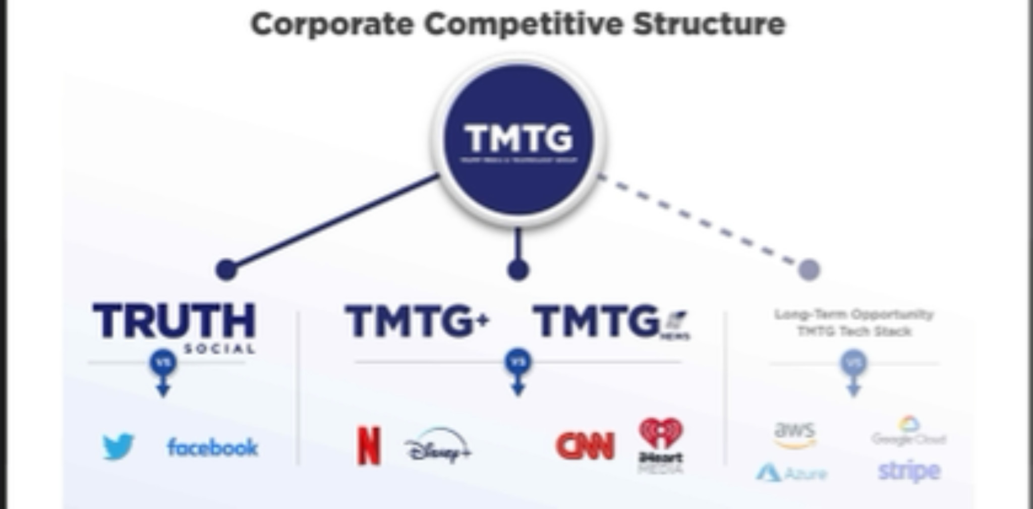
4 slightly different shades of green. Plz fix.

Bowl Leader
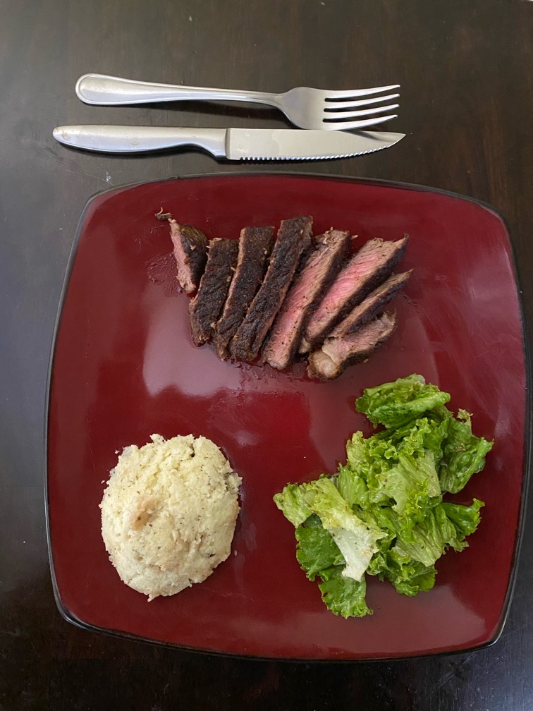
First time cooking steak. Yay or nay!
Conversation Starter
Rising Star
Any websites offering free CPE credit courses?
😂 this is too real

And Coronavirus also......geez. 🤦♀️

Lol shots fired

You can be not nice or not smart. Pick one.

what the hell did I write

someone doesn't give af
Visual Storyteller
Conversation Starter
Our generations greatest contribution is memes

Thank you for your service

Visual Storyteller
Incroyable - who built this deck?
Nailed it! 😂

Consulting bowl when all Deloitters move to MBB.

This site is protected by reCAPTCHA and the Google Privacy Policy and Terms of Service apply.
Download the Fishbowl app to unlock all discussions on Fishbowl.
Copy and paste embed code on your site

Scan your QR code to download
Fishbowl app on your mobile


I think that was on purpose. We have that slide template too but with purple instead of green
OP where’s the issue there? The only issue is that shade 3 is darker than 4 and 2 is darker than 1
Precisely
LOL this is on purpose, breaks up the monotony of the slide.
Dude the only thing I have is different shades of green. No other colors go well with green.
Red? It’s Christmas.
Blue? Looks off next to green
Orange? Looks like you’re trying to hard to make it work
Yellow? You can’t read whatever is yellow
It’s black, white, and fifty shades of green.
Also, EY is definitely the worst. Yellow and Gray. That’s it….
Noone is going to talk about the actual bs on the slide :)?
We don’t do that here…
Capitalized And in 04 is triggering me
I can't believe companies pay millions for this.
Not enough contrast to be meaningfully different, and even if that were the goal, should progress light to dark, not have the darkest at #3 of 4.
It’s amazing how many people at large firms have no clue about leading design practices.
What’s a good reference for this
I think the left two are the same
They’re not haha
This is discrimination towards the color blind
Contrast between background and text is fine. This is compliant, just dumb.