
Thoughts on the rebrand?
Bowl Leader
Conversation Starter
Bowl Leader
This site is protected by reCAPTCHA and the Google Privacy Policy and Terms of Service apply.
Download the Fishbowl app to unlock all discussions on Fishbowl.
Copy and paste embed code on your site

Scan your QR code to download
Fishbowl app on your mobile


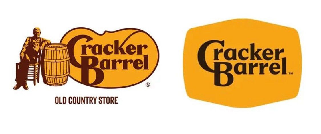
Simpler doesn’t mean better. I think it’s too much of a departure from the previous logo that it will undoubtedly get lost among the sea of other mediocre breakfast chains. It’s lost any sort of differentiation other than the font. Compare it to a Denny’s logo.
Bowl Leader
I honestly feel for any creatives working on something like this. It’s got to be one of the most scrutinized things to do.
I don't think it's great, but not for any culture war reasons. I get that banishing the old dude and the barrel was an attempt to make it look like it wasn't stuck in the past. But the new logo is just kind of a bland corporate logo. I assume their research tells them that being an old country store means they were missing out on potential audience. But if that's the literal brand, perhaps there could be a better way to bring in a new audience.
Bowl Leader
Yea, I’m not looking for a political debate, just marketers’ POV. For me, the keeping the font was an issue. I thought they would opt for something simpler and cleaner.
Bowl Leader
That was quick…
Subject Expert
I like that it’s simpler. Where is the barrel?
Bowl Leader
The frame is the barrel.
I am outraged!
Subject Expert
Here is a fresh take on the rebrand. https://www.linkedin.com/posts/kaleb-dean_im-not-three-months-late-with-this-one-activity-7364392958609010688-RCiq?utm_medium=ios_app&rcm=ACoAAAAtvQAB0RnPsz0cUBRKGBnzSCFTy7KhuZg&utm_source=social_share_video_v2&utm_campaign=copy_link
A very store bought take imo