

Related Posts


Bowl Leader
Anyone know what these badges are?



Conversation Starter
Not gonna lie, I’ll probably try this.

Additional Posts in Copywriters


New to Fishbowl?
Download the Fishbowl app to
unlock all discussions on Fishbowl.
unlock all discussions on Fishbowl.


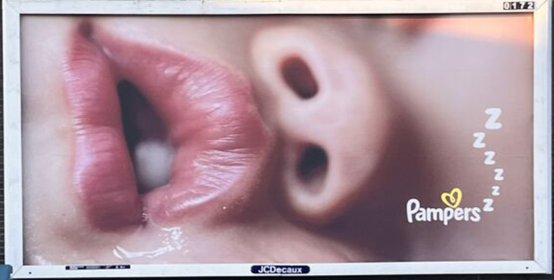
Is this a real ad? Shocked a client would buy it tbh. Do pampers help kids sleep better than some other diaper brand? This feels too broad to be meaningful but what do I know.
Glad I wasn’t the only one thinking this
I find the close-up of the drooling baby mouth off-putting.
I'd add a line about being tucked in for the night to tie it closer to the product.
The ‘zzzzzz’ does the tucked in / comfort message in a more emotional way than spelling it out.
They could've chosen a much better photo. I don't like that one at all. It's focusing on the child's nostrils and tooth, and not how comfortable they are while sleeping in their dry Pampers diaper. I think it's a fail, and distracts from selling the product.
I'm with you. Doesn't need anything. Love this! As it is.
There is copy: ‘z z z z’. It works.
Ads should be copy led or art led. If there’s a visual solve not a ton of copy needed, if it’s a headline ad, simple or more understated visuals usually.
They shouldn’t be competing for your attention in the visual hierarchy.
Thinking about global accessibility and those that may rely on assistive tech for text and alt-text images it may “read“ like: baby mouth drool pampers zzzzzzzz. I guess it might convey something. 🙃
If a user/consumer is visually impaired or has difficulty reading and uses a screen reader, the image alone may not be accurately recognized by the technology. The image/ad could be skipped over entirely if it doesn’t have descriptions in the html or alternative text.
No copy needed but that’s a big ass tooth
A wider shot would’ve been better but copy is definitely not needed.
Stet. Good as is.
This little piggy went to sleep.
Doesn’t need copy. Love the zzz. But the picture is not endearing.
No line needed
“Keep working the brief.”
This is great. I’d maybe be using this to push the overnights product but that’s just a logo swap.
Agree, maybe a snore, or a sigh when you do a TV for sound but that's it.
If pampers were well known for being more comfortable and “sleep-friendly” than other brands and this is an established product benefit, I’d say it’s good as is. The Zzzs help at least communicate that a bit. But if not, it’s a little blind.
I'm lame cause I wish it said pamperzzzzzzzzzz