

Related Posts




Additional Posts in Brand Side
Hello guys
Please help me get 11 likes.


What’s it like at Verizon?
Do you ever regret leaving agency life?
New to Fishbowl?
Download the Fishbowl app to
unlock all discussions on Fishbowl.
unlock all discussions on Fishbowl.


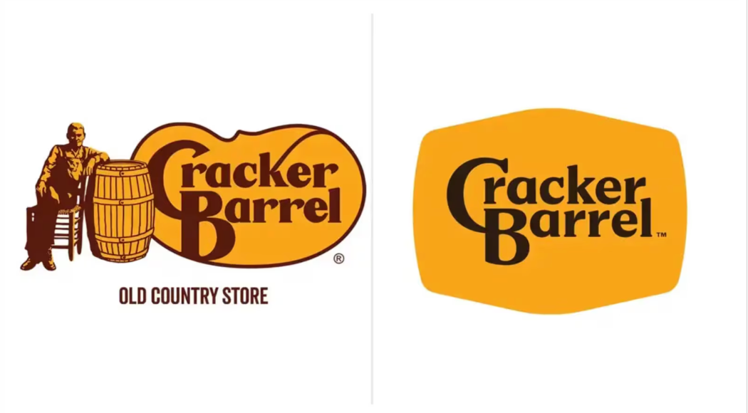
It is a ton easier on IP control and reproducibility - their trademark people and merch people should be jazzed by this.
The politicizing of it is childish.
It's a prime example of how boring & corporate sterile we have become. Forget the logo, it's really everything involved in this change. The whole point of ever stopping at a cracker barrel was the old time feel. The newly renovated buildings look like every other modern chain restaurant. Might as well just say "we're IHOP, but with a mustard yellow color scheme."
I would argue that the underlying reason people are pissed off has less to do with politics and more to do with corporations continually taking the few stable things left in their world and changing them when there isn't really a need.
And yet they botched it so bad that they accelerated that brand dilution. I grew up in Florida, so went to one pretty regularly. Quality definitely was on the decline and something needed to happen....but this wasn't it
The logo needed to be updated for lots of valid reasons about display across digital media. Much of the backlash is fake outrage by people in the fake outrage business who need unending cultural strife to keep making money. But the result did come out dull, and when the whole ethos of your business is “antique store of pre-WWI furniture that serves food,” you have to keep a piece of that intact.
Not a huge fan of the new logo but I'm with others on how the old one wasn't all that great too. It had too much going on and if I were to decide how the logo would look, it would probably have only the barrel.
I don’t care about a company’s logo, as long as I can continue to go there and get what I like. I’m a logical person. It still looks dated so it has that going for it. I’m in the “who cares” category, but I don’t eat there, so no emotional investment.
As a designer, I say the new logo is much more scalable and better for both print and digital applications.
the loyal customer base they have is dying. that “rooted in nostalgia vibe” is a collection of thinly veiled racist tropes, and the food is shit. this was a pivot for the future, new customer growth, and CPG design flexibility. I don’t care if it works or not. Would rather Waffle House any day.
Agree. The new one needed to still respect the history while tilting toward the modern future. The new one felt bland.