

Related Posts

Rising Star



Bowl Leader
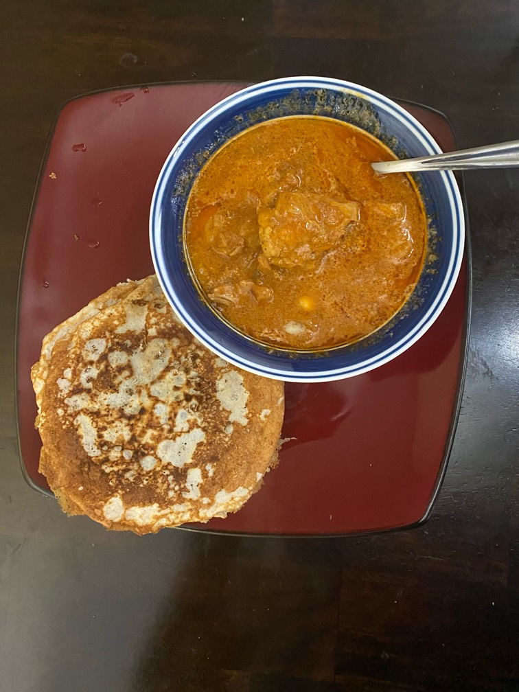
Butter chicken and coconut flour tortillas


Rising Star


Real Estate Rookie podcast thirsty for subs


Bowl Leader

Visual Storyteller
Visual Storyteller
More Posts
How many job titles and hashtags is too many?

Enthusiast
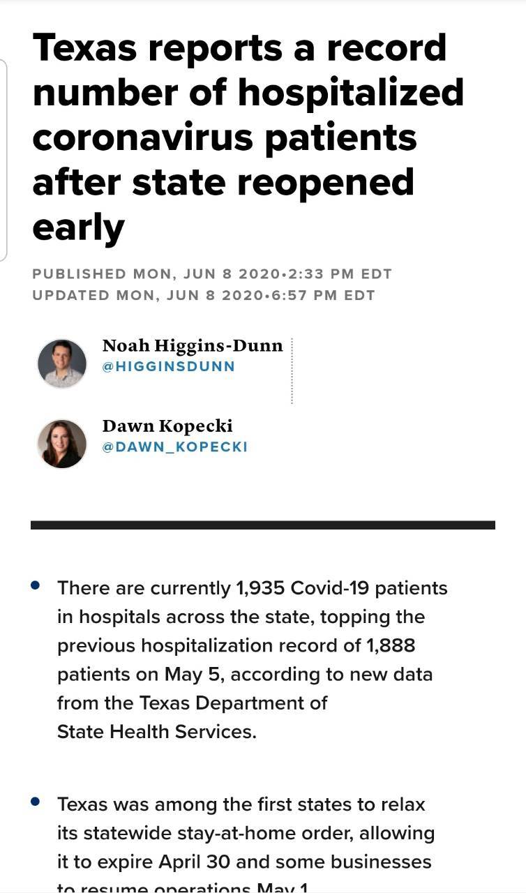
inspired by a true story!
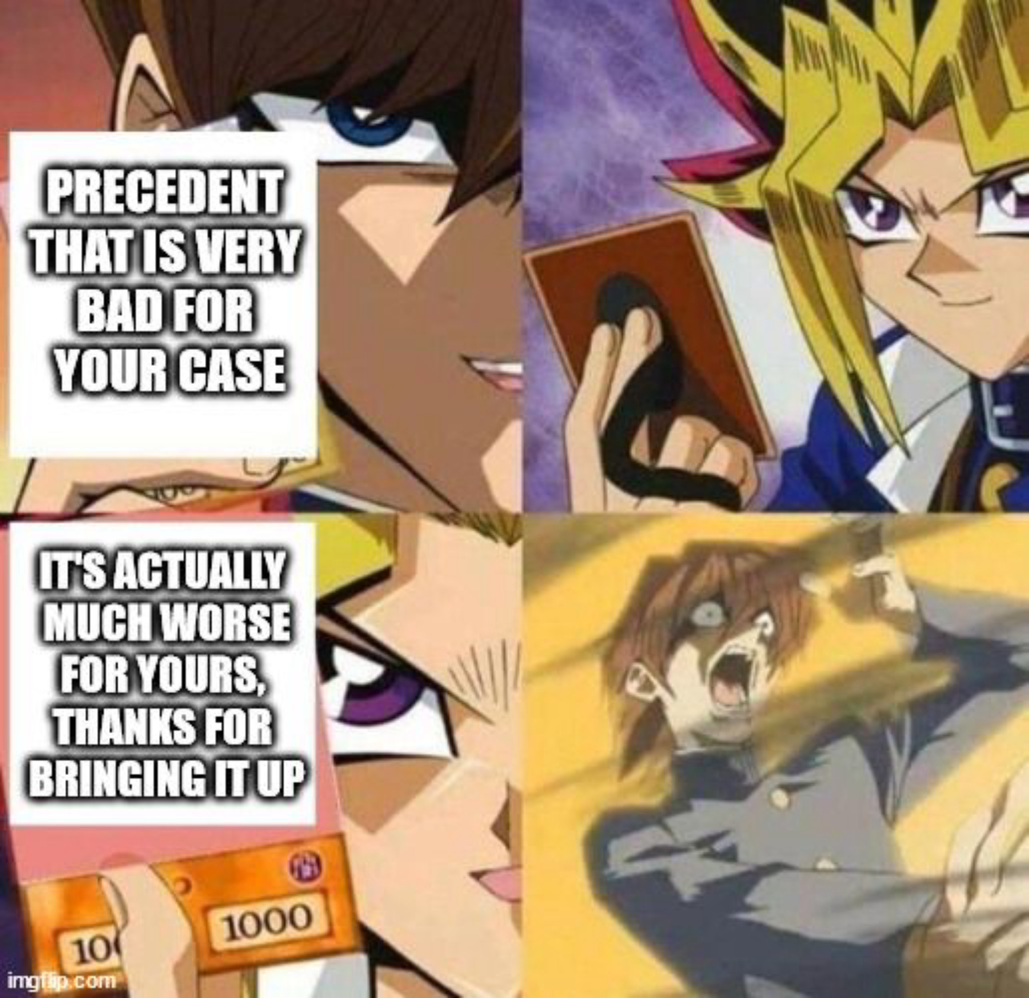
high school me 🤝 attorney me
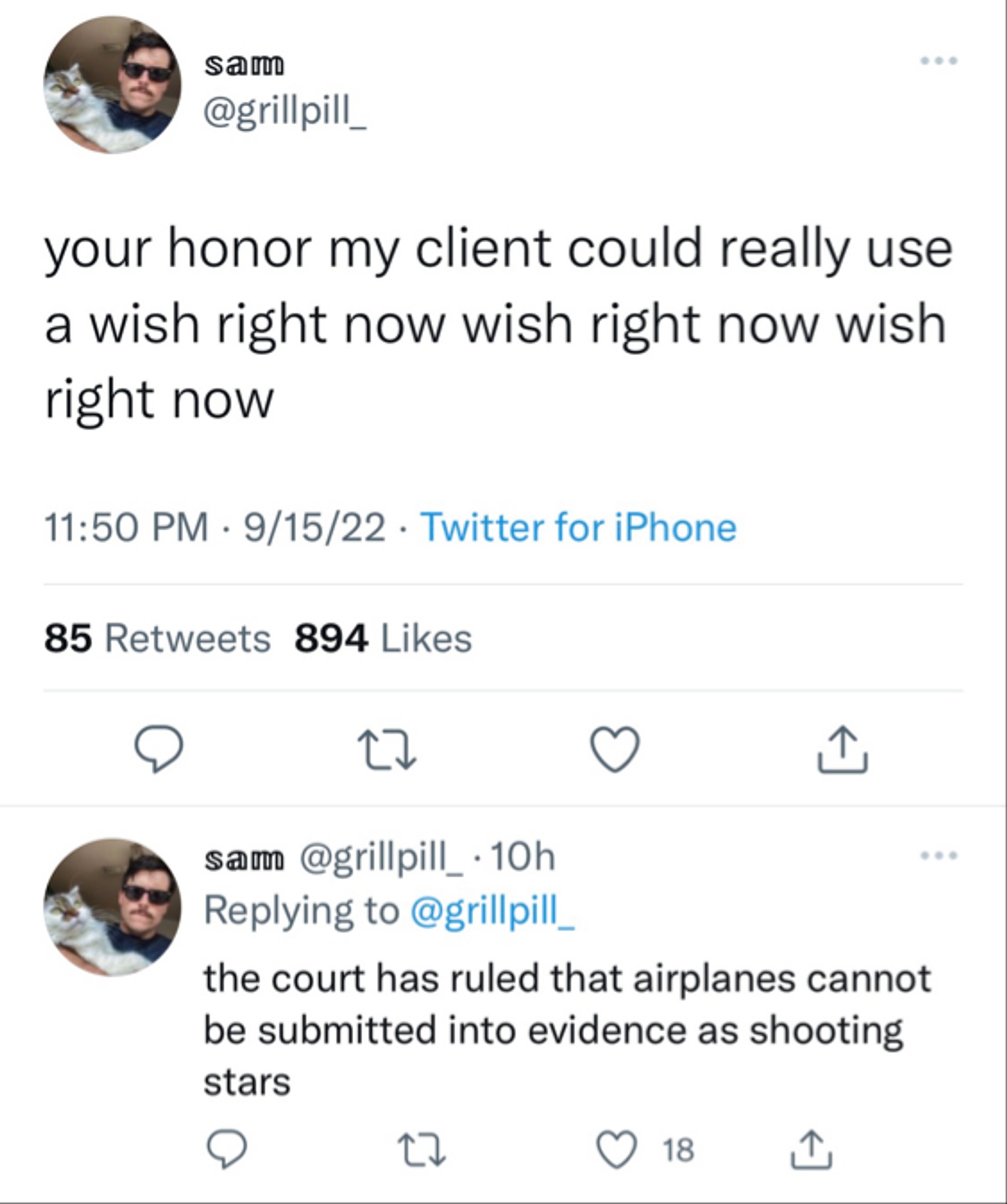

Conversation Starter
Conversation Starter
Visual Storyteller


Community Builder
Mind if i drive?

Additional Posts in Portfolio Review

Can anyone provide feedback on my portfolio?
Bowl Leader
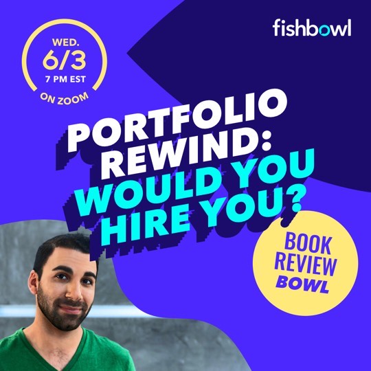
Hey, Fishies! We’re launching our first Interview/Q+A series "Portfolio Rewind: Would You Hire You?"
Like a portfolio review in reverse, creative leaders will share work they created when they first started out and critique it as if were a book that had just landed in their inbox. Then, tell us if they’d hire their younger selves knowing, and expecting, what they do now.
Drop in for get the chance to ask questions, and get your book reviewed by our guest. Hope you can make it!
zoom.us/j/92635977143
Bowl Leader
New to Fishbowl?
unlock all discussions on Fishbowl.


Payne is a good dude, worked with him before he went out to Dallas. I'll take a look on my computer and send you an email
Payne rules, thanks!
It's all good, but not great. Each spot or print ad was well-made, but it delivered on the message in a fairly straightforward way. There were no twists, no surprises, no holy-shit moments, no hilarity, and no emotion. The "Taco" was confusing at first. If you can tweak that intro of "Tacoma Time" to have the "ma" flicker or come up after "Time" that could help. The Super Bowl spot is a big deal to have so early in your career, but I found the face of the driver to be extremely punchable; if you can edit him out I'd do it, and at the end I'd hire a CGI artist to re-create that actual pinball machine and when the car slides into position at the end, I'd cut as soon as it stops to the entire pinball machine falling over, with "TILT" blinking in red . You could probably do it for $4000 if you find someone on Upwork, and you should (or come up with a simpler, funnier, more exciting finish than a quiet bird's eye view of the pinball field floating in some weird void), because this is your crowning portfolio piece, and it ends with a whimper but deserves a bang. I'd add some music to your jingles; they're cute but feel like they go on forever. The Saatchi Shuttle print only needs to be the first one, the other two are flat. Finally, cut your student work out, or pick three of them that represent your absolute best work and just present them as part of the portfolio without any indication that it's spec (of course if anyone asks don't lie, but let them ask).
Thanks very much for the detailed feedback. It’s in line with much of what I’ve heard—that it’s pretty boring all over. With more time on my hands, I’m going to try to focus on making new things rather than spend $4k on an existing spot. My student work kinda hurts to look at, but I’m not sure if that’s just me. I hear you though that I should not break that into it’s own page, but rather find 1-3 that I still like (enough to fix/improve) and just put it in with the rest. Again, I appreciate your help, and thanks for your time.
Why charts and numbers saying your super bowl ad was great? Your ad should talk by itself. If the CD/ECD/CCO don’t think your work is great, putting a lot of charts there won’t change their minds.
Less is more. Let your work speak by itself.
But this is just my opinion, don’t take it for granted.
Sadly those are the best shots we could get. We weren’t even involved in the creation of it—it was an idea we pitched and didn’t find out until after the fact that it got made and was brought to some NASCAR events.