
Related Posts
Conversation Starter
Pro forma or proforma?
Bowl Leader

Additional Posts in Designers
Coach
Hey Bowlers, I launched an interactive kiosk leveraging Typeform to automate onboarding and personalize customer experiences at scale.
Key features
- Rapid Checkout
- CRM Synchronization
- Integrated Slack Support
- Data Manager
Open to pessimists and optimists alike to give honest feedback on what you think about the product. In search of teaming up with a designer (with pay) if you have useful insights or better story telling abilities. (See link below)
Please and thank you.
https://www.canva.com/design/DAErzR4fnbU/94_1cMfCiV9zU_pHWhZG8w/view?website#2:take-action-now-and-receive-a-50-discount-offer-expires-10-17-21

Best online classes for newbies?

For those of you who build websites, how do you display your built sites on your portfolio site? Do you have a page where you mock up the site or do you do a direct link? I currently have both. I’m just trying to figure out the best way for me. Here is my site for reference. The links for the sites are in the menu and below in the gallery. Sarahbellestudios.com
New to Fishbowl?
unlock all discussions on Fishbowl.


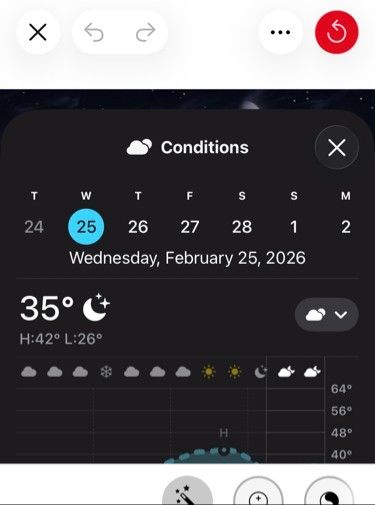
In the screenshot you can see how the photo edit cropping interface has the close button on the left (the white area), but then the weather app still has it on the right (which used to be on the left in earlier iOS iterations about 15 years ago).
The design reasoning for it being on the left:
It’s distinctly Apple (Microsoft is on the right).
We read from Left → Right.
Back → Next.
Small → Big.
Negative → Positive.
Off → On.
Cancel → OK.
Close → Open.
The close button on the right came from Windows to avoid being too similar to Macintosh. Then people got used to it, even though it’s backwards. Android has a “Windows-y” feel to it and has also done the close button on the right.
Early iOS had close or “Back” on the left.
More inconsistencies.
Stocks app: close is correctly on the left.
Weather app: close is incorrectly on the right.
Weather app: close is incorrectly on the right.