
Conversation Starter
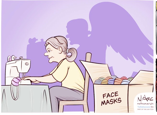
Here’s an animated chart that shows how COVID-19 cases and deaths have grown globally compared to their causes of death like fire, influenza, and malaria over the same time frame. The timeline begins on January 1, 2020, and COVID-19 starts at the very bottom of the chart with zero deaths.
Posting as :
works at
Related Posts
Conversation Starter
Enthusiast
Bowl Leader
Mentor
Pro
More Posts
Pro
Anonymous User
Conversation Starter
Pro
17/13 check in
Upper body day for me!
Hello All, I have one question. I was a fresher and joined one organization as external employee with third party payroll. I worked as external payroll for 1 year then I became permanent employee of organization was working. When i was a fresher my salary was below tax slab so my external exployer did not generate any form 16 for me. When tried to switch my new organization wants me to submit form 16 as BGC process. Will my offer get reverted?Cognizant Tata Consultancy HCL Technologies Accenture
Bowl Leader

Additional Posts in The Worklife Bowl
Pro
Updated my wifi SSID

Pro
Just finished work. What’s everyone listening to?

Enthusiast
Conversation Starter
Pro
Conversation Starter
Chief
Enthusiast
New to Fishbowl?
Download the Fishbowl app to
unlock all discussions on Fishbowl.
unlock all discussions on Fishbowl.

